All work

Account originations

KeyBank account opening
Role
UX Designer, account opening end to end
Team
UX Lead, me, and a visual experience designer, at g2o
Timeline
Started March 2018, six month UX delivery
Impact
55 minutes to under 10, and 4 follow-on contracts
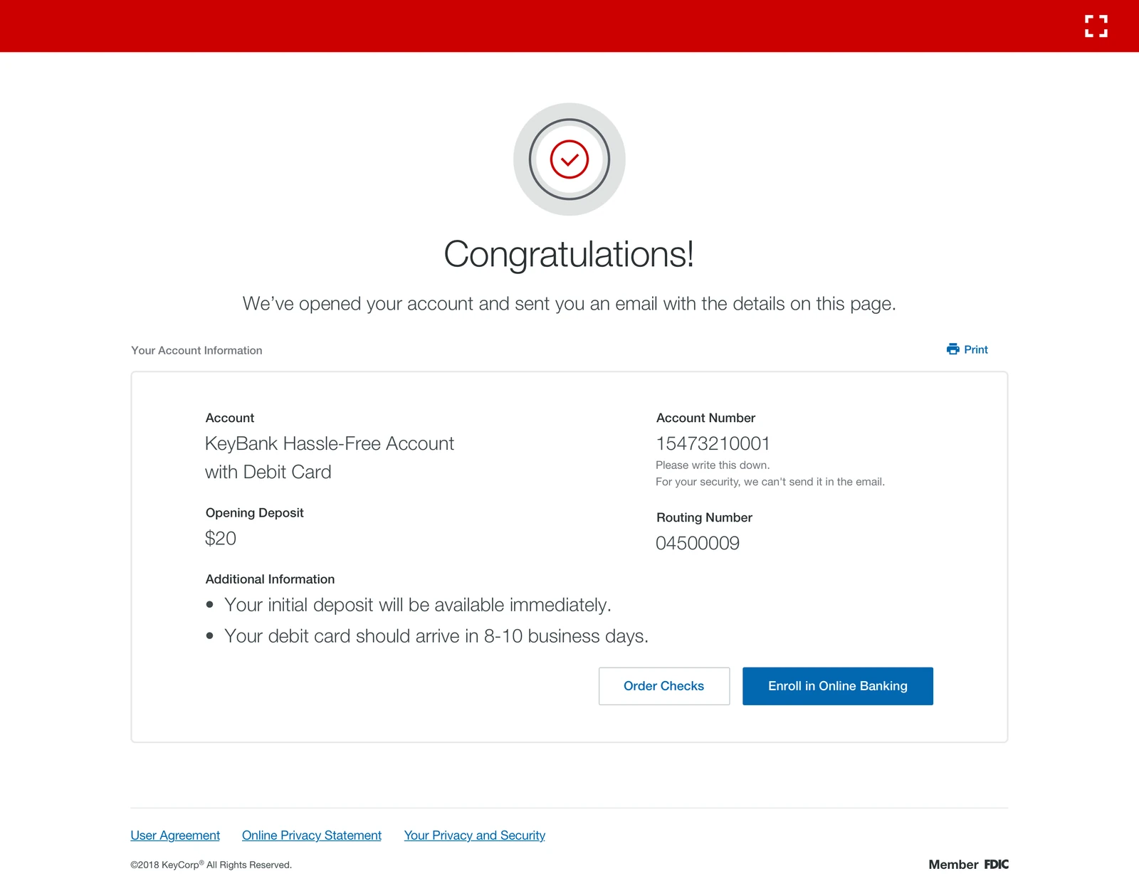
The confirmation screen of the new flow. A red check mark above the word Congratulations, then Your Account Information listing a KeyBank Hassle-Free Account with Debit Card, account number, a 20 dollar opening deposit, routing number, a note that the initial deposit is available immediately and the debit card arrives in 8 to 10 business days, and buttons to order checks or enroll in online banking.
01

Background

I lost a $75,000 direct deposit client because Key Counselor crashed mid-way and I couldn't get it to work. Client left the branch frustrated.

KeyBank branch manager, 48, April 2018

The average time it took for KeyBank customers to open a deposit account in branch was 55 minutes. The process was excruciatingly slow and unreliable, resulting in several customers taking their business to another bank. Since 51% of their prospective and 63% of their existing customers preferred going to a branch to open accounts, KeyBank was losing money.

KeyBank leadership also wanted to streamline the account opening experience into one overall flow that could replace their then disparate online and in branch experiences.
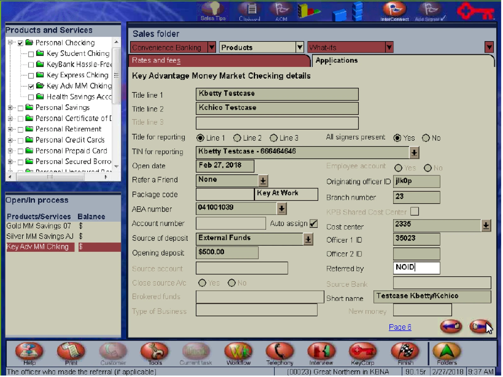
Key Counselor, the system being replaced. A dense Windows application with a products and services tree on the left, a Sales folder pane of tabs, and a Key Advantage Money Market Checking details form of roughly thirty small fields covering titles, signers, deposit source, branch and officer numbers, over a strip of icon buttons along the bottom.
Key Counselor, the system being replaced. Everything on one dense form, in a vocabulary only a trained banker could read. This is the 55 minutes.
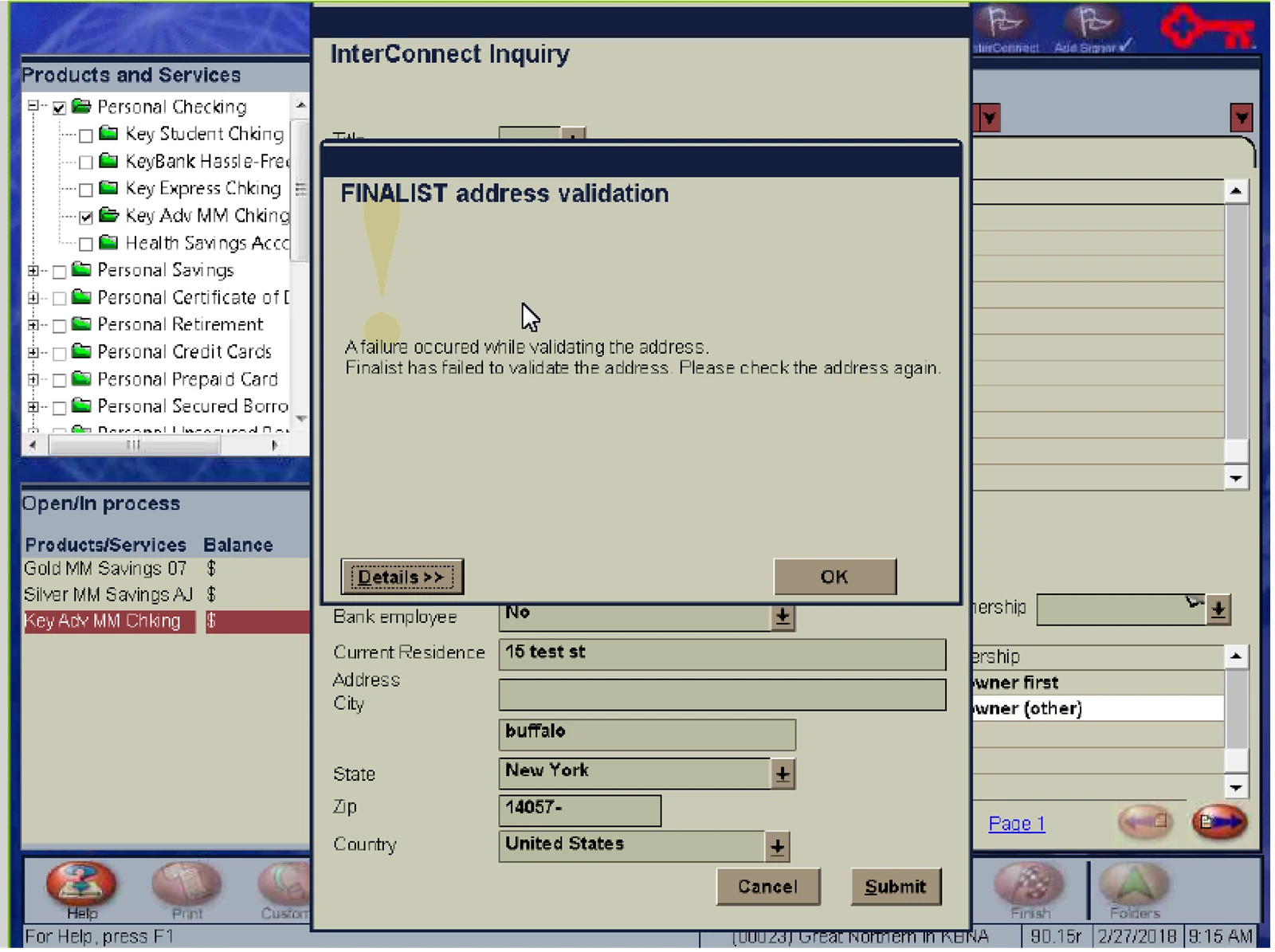
The same legacy system with a modal titled InterConnect Inquiry over it, reading Finalist address validation, a failure occurred while validating the address, Finalist has failed to validate the address, please check the address again, above a form of residence, address, city, state, zip and country fields with Cancel and Submit buttons.
Where it broke. A validation failure mid application, reported in the language of the service that failed rather than anything the banker or the customer could act on. This is the crash in the quote above.
02

Project goals

The ask from KeyBank executives was to bring the average account opening time in branch to under 15 minutes. On top of that, our UX proposal had to be able to scale to a self service experience online.

The project was initiated in March of 2018 with a UX delivery timeline of six months. What was in scope over those six months:

  • Competitor landscape. How other banks opened a deposit account, in branch and online.
  • Process review. Working with business stakeholders and branch managers to review their actual processes.
  • Business and legal alignment. Getting KeyBank's business and legal groups aligned on the design proposals.
  • An end to end flow. A redesigned in branch flow that was then also extended to their online account opening flow.
03

Team and role

A UX Lead, me as the UX Designer, and a visual experience designer. My responsibilities included:

  • Creating interaction design flows
  • High-fidelity mock ups
  • Prototyping
  • Organizing leadership reviews
  • Usability testing
04

Design and outcomes

Given KeyBank's ask to create a proposal that could easily scale to a self service online experience, I focused on designing for end customers who may not have the same financial expertise as a branch associate. That is a harder audience than a trained banker, and it set the bar for every question in the flow.

After analyzing competitors' account opening flows, I aligned with decision makers at KeyBank to eliminate several redundant and unnecessary steps. I also proposed areas where data collection could be automated, which saved more time. With the remaining steps I designed an experience that followed logical steps, and worked with a UX writer to reframe questions so that collecting information was easy and transparent.

The redesigned end to end flow was delivered for the branch and then extended to KeyBank's online account opening flow. These are the outcomes measured after launch.

88% Reduction in account opening time

Under 10 min Average opening time, goal was under 15

4 Follow-on contracts awarded by KeyBank

05

Experience

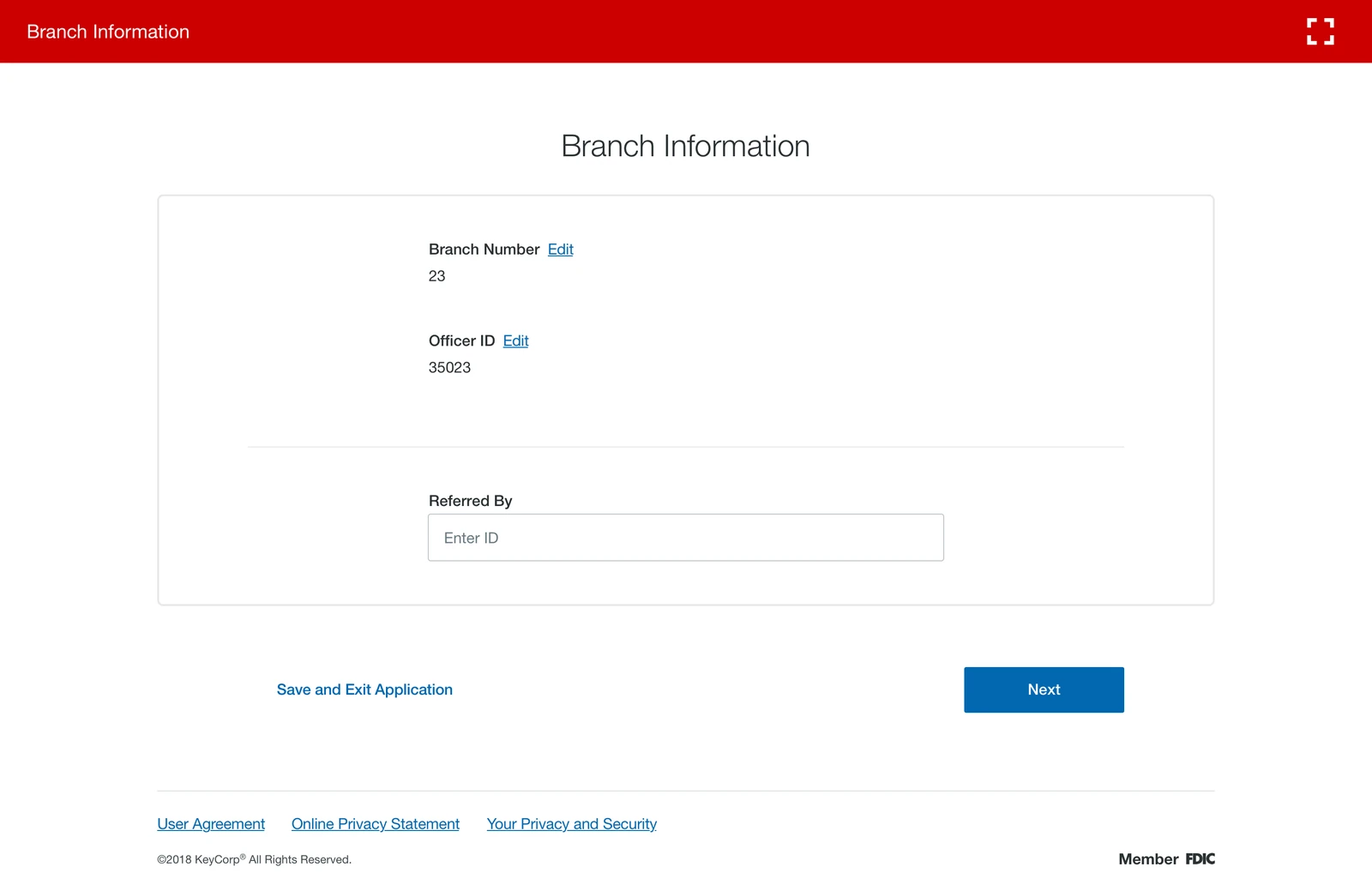
Branch Information, the first screen of the new flow. A single card holding branch number 23, officer ID 35023, each with an Edit link, and an optional Referred By field, with a Next button and a Save and Exit Application link.
Branch information. The first screen, and the shape of every screen after it: one question group, prefilled where the system already knows the answer, one primary action. Save and Exit is always available, because a branch session gets interrupted.
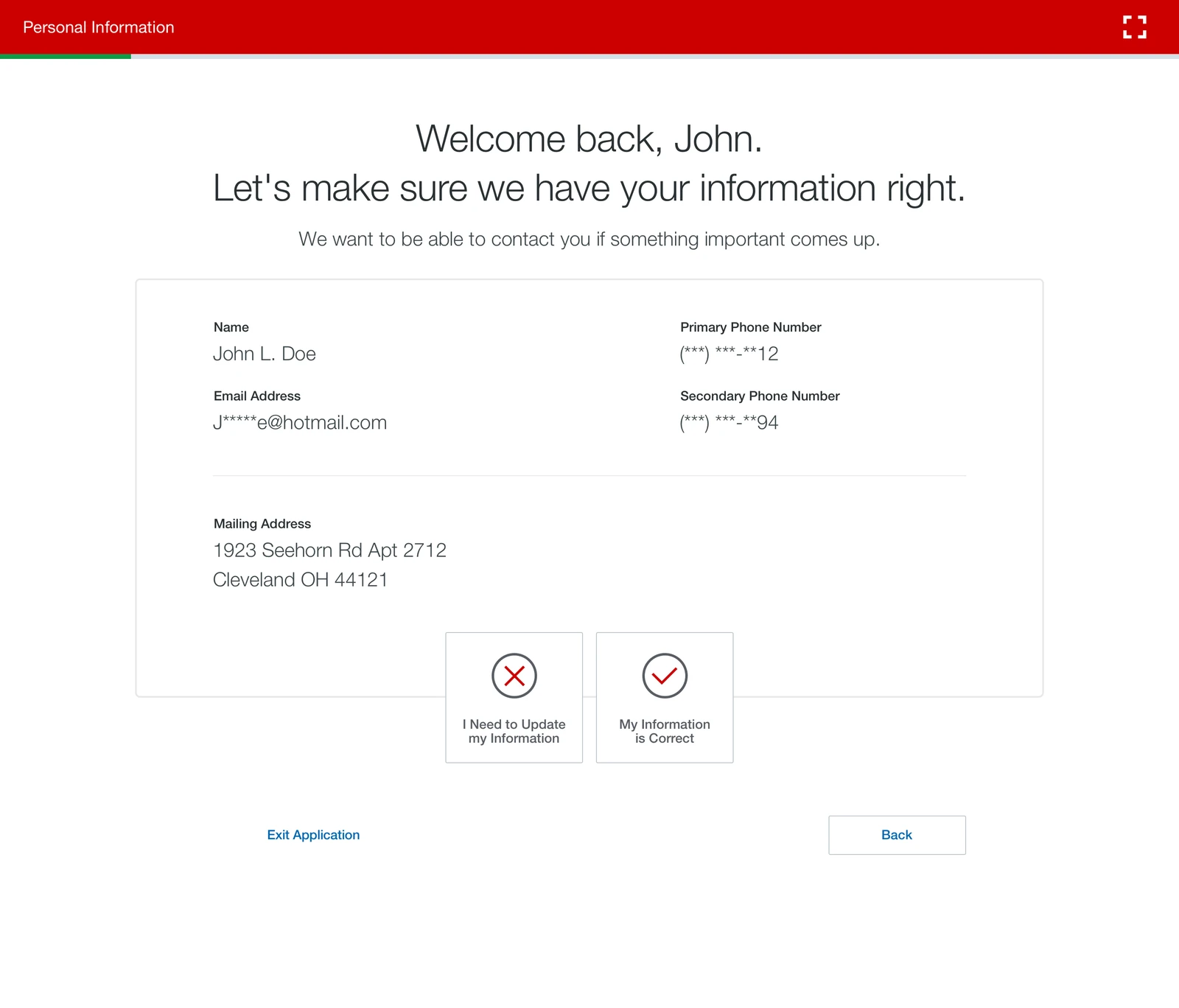
Personal Information. A heading reading Welcome back, John, let's make sure we have your information right, then a card showing name, email address, mailing address and two masked phone numbers, and two large choices at the bottom, I Need to Update my Information and My Information is Correct.
Personal information, as a confirmation. For an existing customer the fastest version of a form is not a form. Everything KeyBank already held is shown back, and the only decision is whether it is still right.
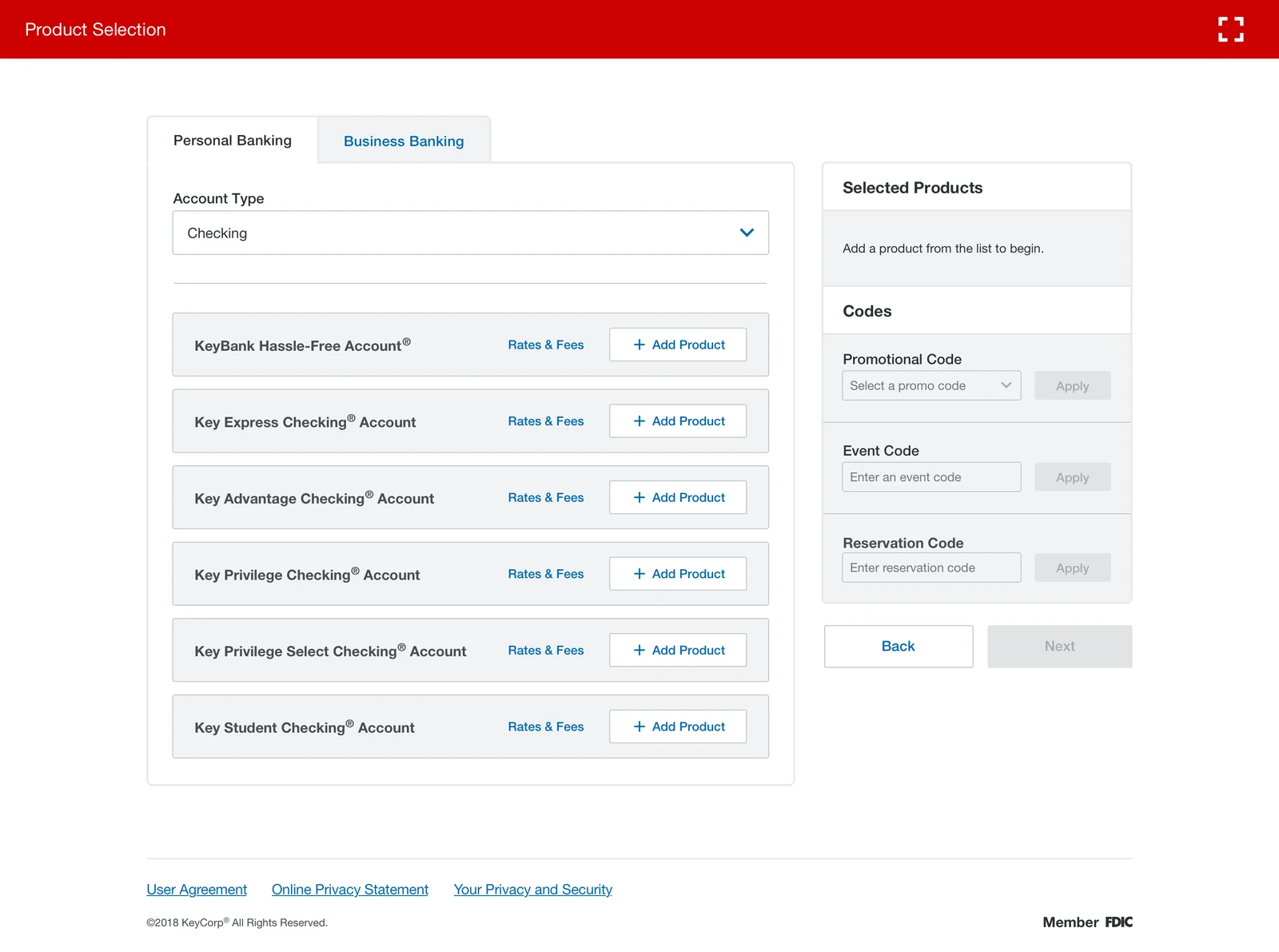
Product Selection. Personal Banking and Business Banking tabs, an Account Type menu set to Checking, then a list of accounts including KeyBank Hassle-Free, Key Express Checking, Key Advantage Checking, Key Privilege Checking, Key Privilege Select Checking and Key Student Checking, each with a Rates and Fees link and an Add Product button, beside a Selected Products panel with promotional, event and reservation code fields.
Product selection. Rates and fees sit next to every product rather than behind a separate lookup, and the running Selected Products panel means a banker never has to remember what has been added.
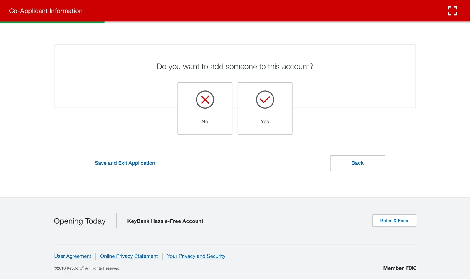
Co-Applicant Information. A single card asking Do you want to add someone to this account, with two large No and Yes targets, above a persistent footer bar reading Opening Today, KeyBank Hassle-Free Account, with a Rates and Fees button.
One question, one screen. Branching questions were pulled out of the long form and asked plainly, so the flow only ever shows the steps that a given application actually needs. The Opening Today bar keeps the product in view the whole way.
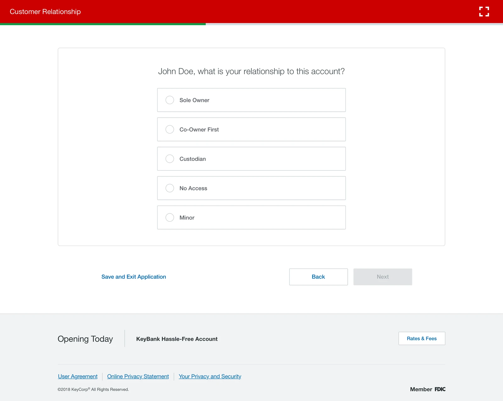
Customer Relationship. The question John Doe, what is your relationship to this account, with radio options Sole Owner, Co-Owner First, Custodian, No Access and Minor, and Back and Next buttons with Next disabled.
Ownership, in plain words. The customer's own name is in the question, and Next stays disabled until there is an answer rather than failing after submission the way the old system did.
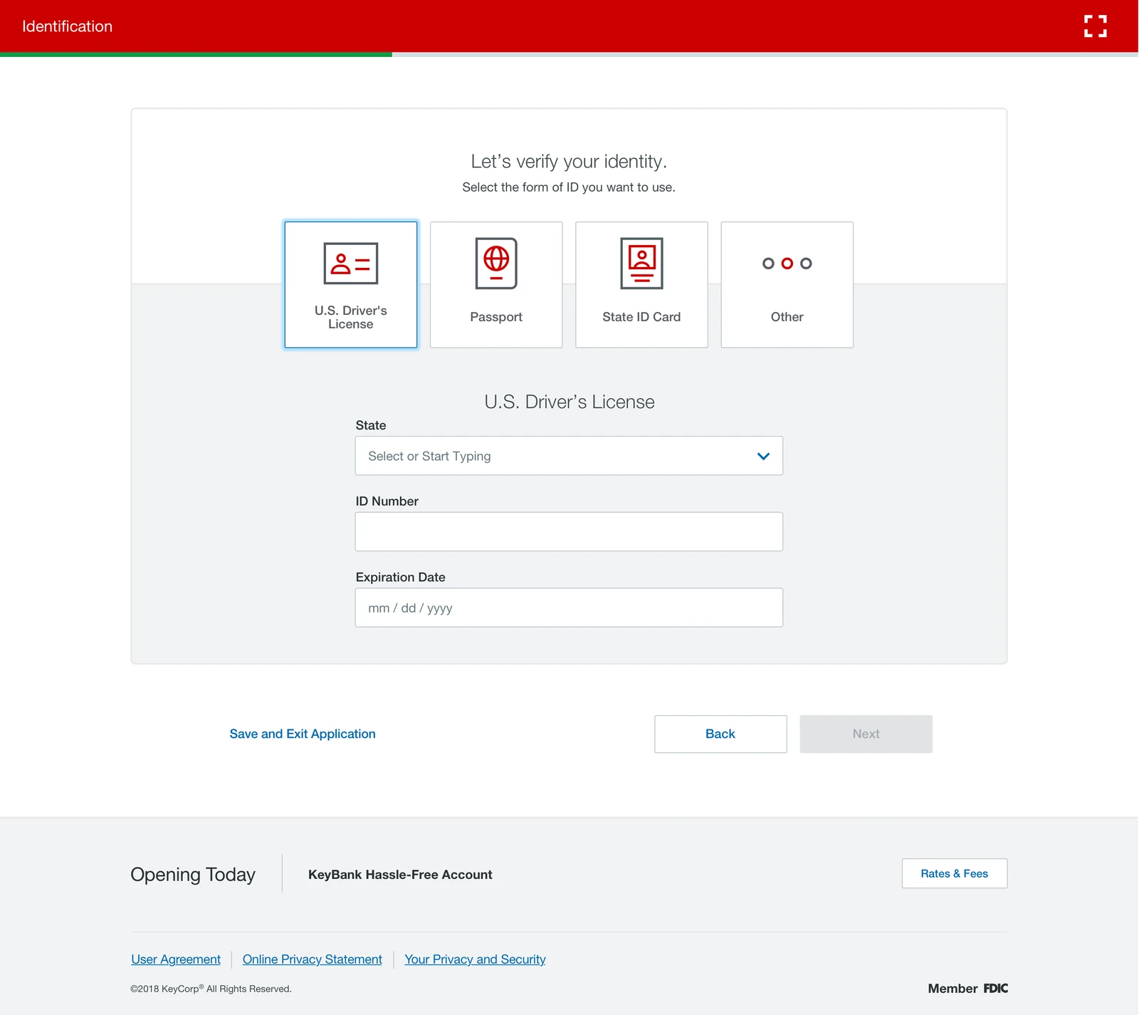
Identification. Let's verify your identity, select the form of ID you want to use, with four large choices, U.S. Driver's License, Passport, State ID Card and Other, the first selected, revealing State, ID Number and Expiration Date fields below.
Identity verification. Choose the document first, then see only the fields that document needs. The old form asked for every field for every ID type.
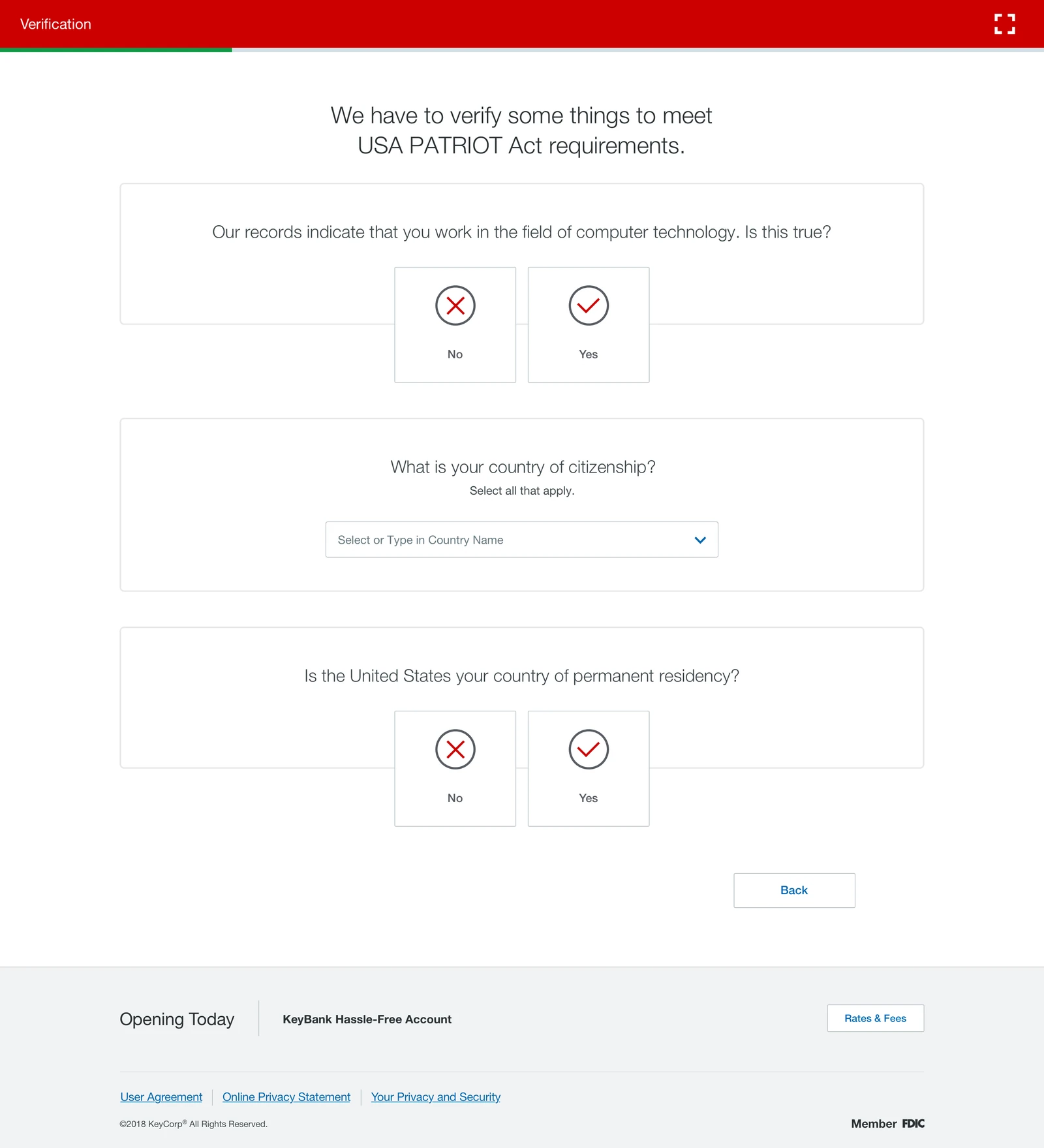
Verification. A heading reading we have to verify some things to meet USA PATRIOT Act requirements, then three separate question cards, whether records indicating the customer works in computer technology are true, country of citizenship, and whether the United States is the country of permanent residency, each answered with No and Yes targets.
The regulatory questions, and why they are being asked. Legally required wording was the least movable part of the flow, so the work here was to say up front what the questions are for and to answer them one at a time.
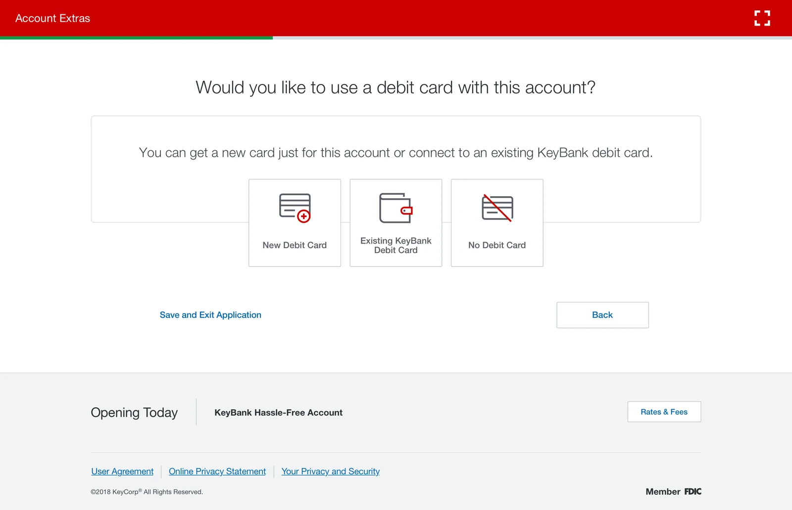
Account Extras. Would you like to use a debit card with this account, explaining a customer can get a new card just for this account or connect to an existing KeyBank debit card, with three illustrated choices, New Debit Card, Existing KeyBank Debit Card and No Debit Card.
Debit card. Three outcomes including declining one, all visible at once, so the option a customer wants is never hidden behind the option the bank prefers.
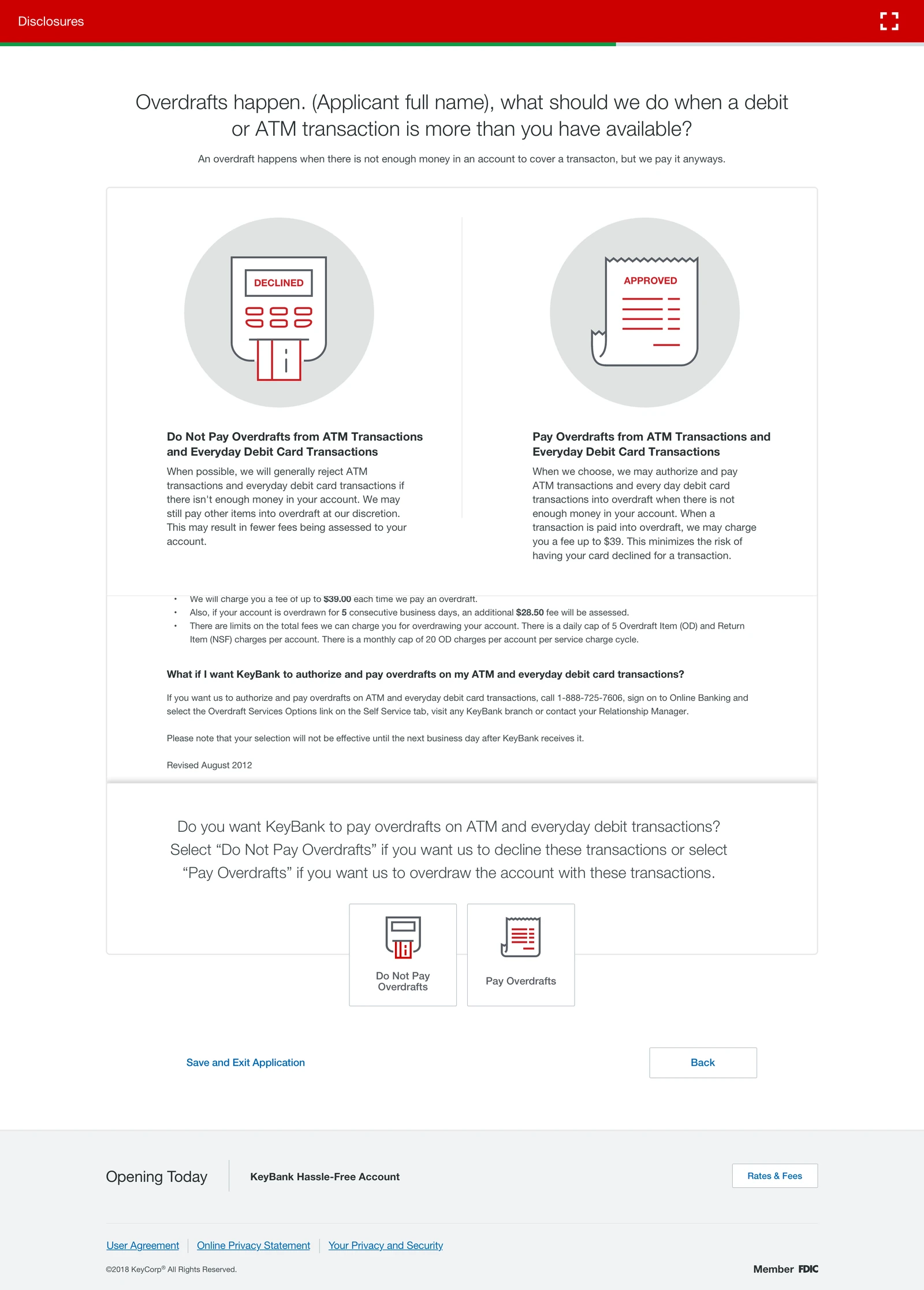
Disclosure. Overdrafts happen, what should we do when a debit or ATM transaction is more than you have available, presenting Do Not Pay Overdrafts and Pay Overdrafts side by side as two illustrated cards with the consequences of each spelled out, followed by the required consent wording and a choice below it.
Overdraft consent. The screen with the most legal text in the flow. Rather than a wall of disclosure, the two outcomes are set side by side with what each one means for the customer, and the required wording sits underneath the comparison.
The confirmation screen. Congratulations, we've opened your account and sent you an email with the details on this page, above a card listing the KeyBank Hassle-Free Account with Debit Card, account number, a 20 dollar opening deposit, routing number, a note that the initial deposit is available immediately and the debit card arrives in 8 to 10 business days, with a Print link and Order Checks and Enroll in Online Banking buttons.
Confirmation. The account and routing numbers printed on screen with the note that they are deliberately not emailed, plus the two things a new customer does next. This is the screen in the hero, at full width.

This page shows only parts of the project. In-depth and sensitive details, and the end-to-end UX, can be covered in person or during the interview process.