All work

Credit card servicing

Amazon Visa Transactions
Role
UX Designer, transactions end to end
Team
Product Manager, me, 12 engineers
Timeline
October 2023, September 2024, September 2025
Impact
10% fewer 1 and 2 star ratings, app rating up to 4.1
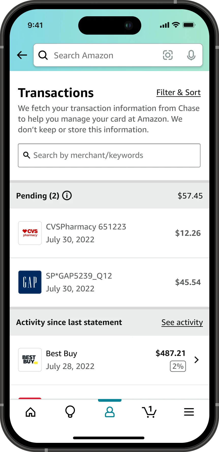
The Transactions screen in the Amazon app, with a Filter and Sort control, a note that transaction information is fetched from Chase and not stored, a search by merchant or keywords field, two pending charges totalling 57 dollars 45 cents from CVS Pharmacy and GAP, and Activity since last statement showing a 487 dollar 21 cent Best Buy charge earning 2 percent.
01

Background

If this is the Amazon credit card why can't I access the account from Amazon

1 star review, Amazon Visa customer, February 2021

The Amazon Visa is the co-branded credit card with Chase, and Amazon's flagship payment product. Until 2023, managing the Amazon Visa through Chase led to friction, with almost half of 1 and 2 star reviews citing poor account management, 20% of new customers paying late fees due to delays on receiving the physical card, and 6% closing their accounts in 2020.

To reduce late fees and improve ratings, Amazon's S-team brought card management in-house. I led the UX for three key projects, Pay Bill, View Statements, and View Transactions, using customer insights from research to shape the UX strategy and inform product goals.
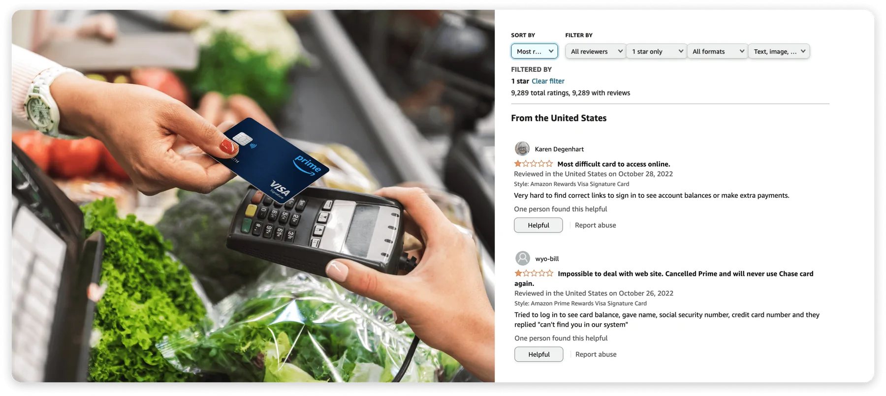
Two panels side by side. A photo of a hand tapping a Prime Visa card on a card reader at a grocery checkout, and the Amazon reviews page for the card filtered to 1 star only, showing 9,289 ratings with reviews titled Most difficult card to access online and Impossible to deal with web site, both describing failed attempts to sign in and see a balance.
The evidence. The card's own reviews page, filtered to 1 star. What customers were rating was account management, not the card.
02

Project goals

The project aimed to reduce 1 and 2 star ratings by 10%, enabling customers to view, troubleshoot, and dispute Amazon Visa transactions by providing fast and clear navigation to transactions of interest and easier usability.

I scoped the competitor landscape, collaborated on business requirements, and obtained alignment with Chase business and legal. The effort delivered four things:

  • A UX vision for transactions. The full experience, past what the first release could support.
  • A UX proposal for the initial release. The subset that was feasible inside the platform we had.
  • Accessibility annotations. Reading order, headings, roles, names, and states, handed over with the mocks.
  • A testable prototype. Something reviewers and research could operate rather than read about.
03

Team and role

A Product Manager, me as the UX Designer, and 12 engineers. My responsibilities were:

  • Interaction design flows
  • High-fidelity mock ups
  • Prototyping
  • Organizing leadership reviews, at both Amazon and Chase
  • Accessibility annotations
04

Design and outcomes

After aligning on the UX vision at Amazon and collaborating with Chase, we faced technical constraints due to Chase's API limitations, which impacted the initial feature set. I refined the UX to focus on feasible features for the first release, and secured Chase's commitment for future updates.

Through multiple reviews with teams across Amazon and Chase, I delivered a user-centric experience that achieved 90% of our original UX vision by the September 2024 release. The rest shipped by September 2025, so the whole vision is now live.

Accessibility annotations were a deliverable here, not a review step. Reading order, heading levels, roles, names, and states went to engineering with the mocks, including visually hidden text that summarizes the pending total so a screen reader user hears it from the heading instead of adding up the rows. The last two figures in Experience are the annotation sheet and the VoiceOver output from the shipped page.

10% Fewer 1 and 2 star ratings, against a 10% goal

4.1 App rating, up 0.4 points

+4.5% Spend lift, 36% of it off Amazon

100% Of the UX vision shipped by September 2025

05

Experience

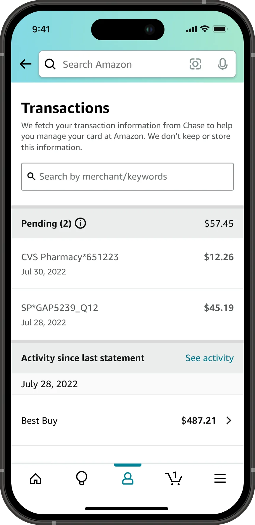
The Transactions screen at the first release, with a note that transaction information is fetched from Chase and not stored, a search by merchant or keywords field, a Pending section totalling 57 dollars 45 cents, and Activity since last statement listing a 487 dollar 21 cent Best Buy charge.
The list, first release. Pending and posted activity, searchable, on Amazon for the first time. This is the version scoped to what the first release could support.
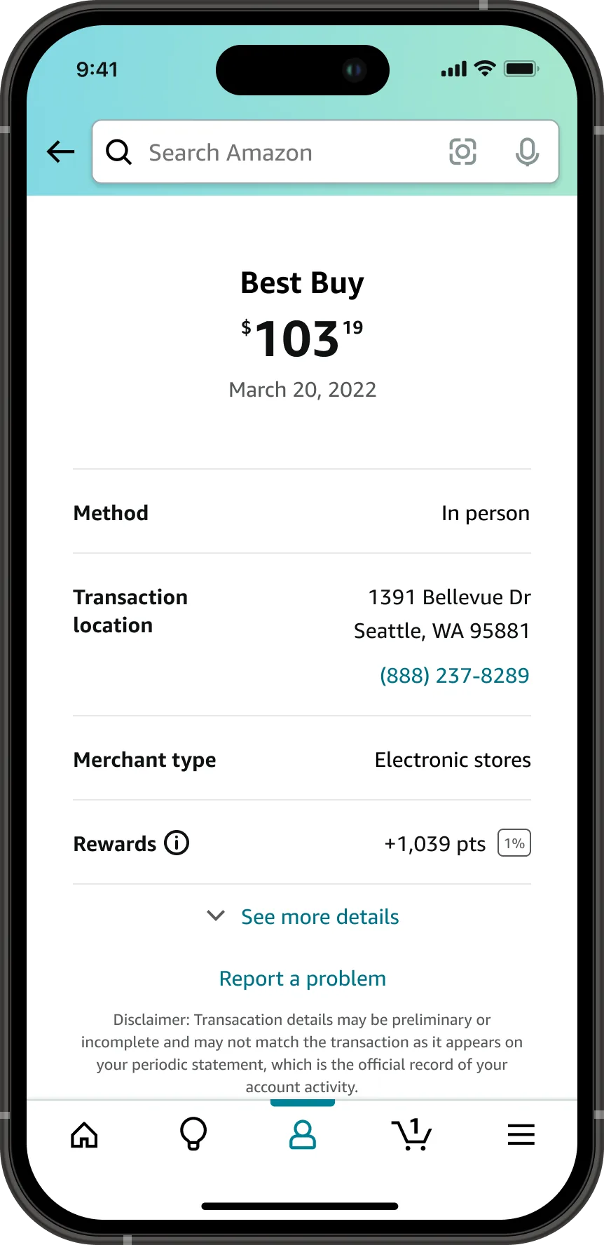
A transaction detail screen for a 103 dollar 19 cent Best Buy charge on March 20, 2022, listing the method as in person, the transaction location with a phone number, the merchant type, and rewards of 1,039 points at 1 percent, above a See more details link and a Report a problem link.
Transaction detail. Enough to recognize a charge: where it happened, when, how it was paid, and what it earned.
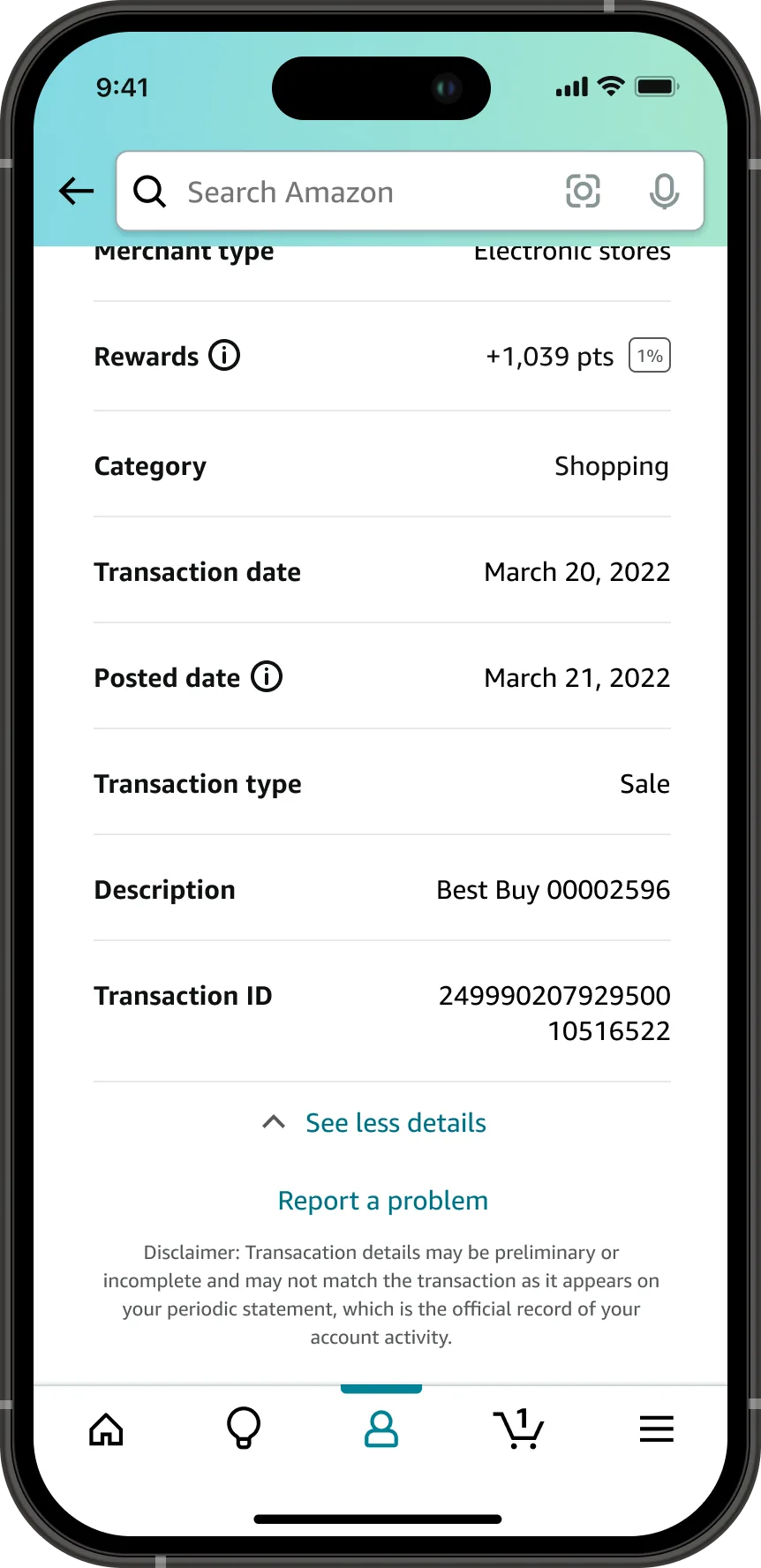
The same Best Buy transaction with details expanded, adding the posted date, transaction type, description, and a transaction identification number, above a Report a problem link and a disclaimer that details may be preliminary and that the periodic statement is the official record.
Expanded, for troubleshooting. The identifiers a customer needs when a charge does not look right, collapsed by default so the common case stays short.
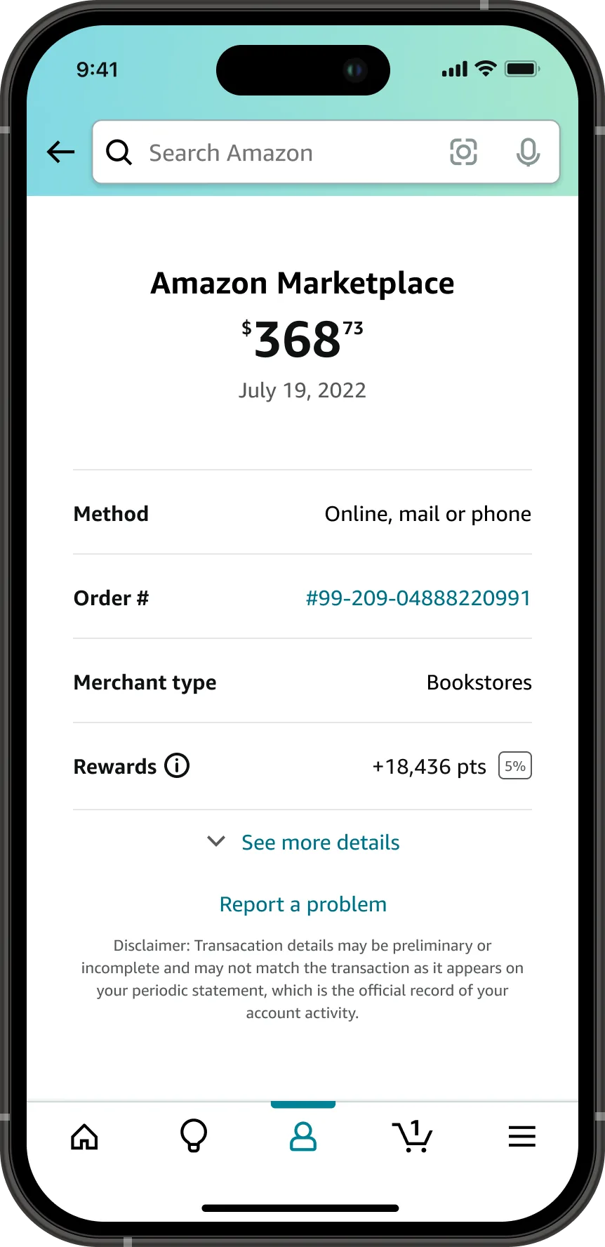
A transaction detail screen for a 368 dollar 73 cent Amazon Marketplace charge on July 19, 2022, listing the method as online mail or phone, an order number shown as a link, the merchant type, and 18,436 rewards points earned at 5 percent.
An Amazon charge, on Amazon. The order number is a link back to the order behind the charge, which is the version of this screen only Amazon could build.
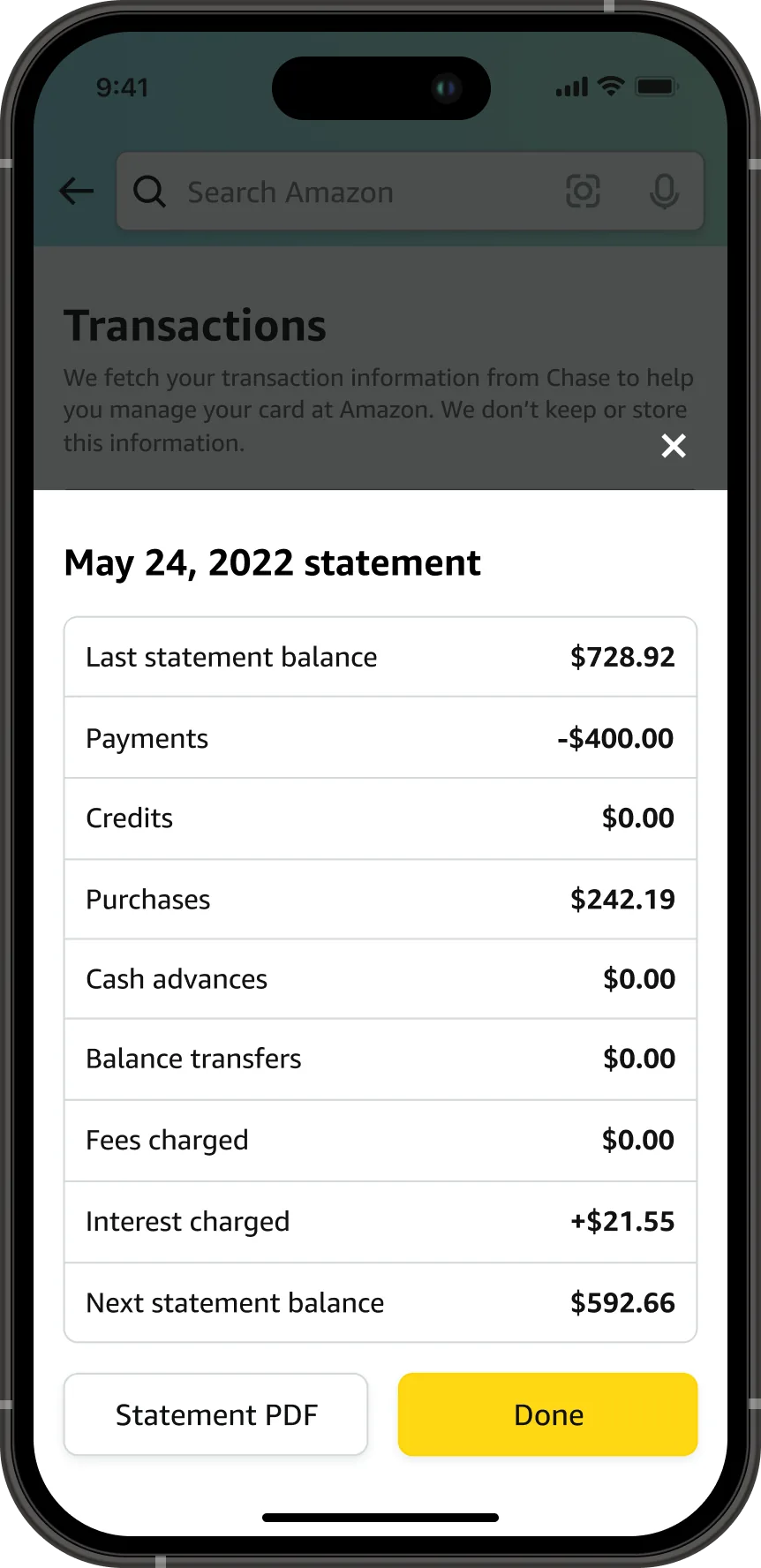
A statement summary sheet over the dimmed transactions list, headed May 24, 2022 statement, listing last statement balance, payments, credits, purchases, cash advances, balance transfers, fees charged, interest charged of 21 dollars 55 cents, and next statement balance, with a Statement PDF button beside a Done button.
Statement summary, in place. Opened over the list instead of on its own page, so a customer checking one month does not lose where they were.
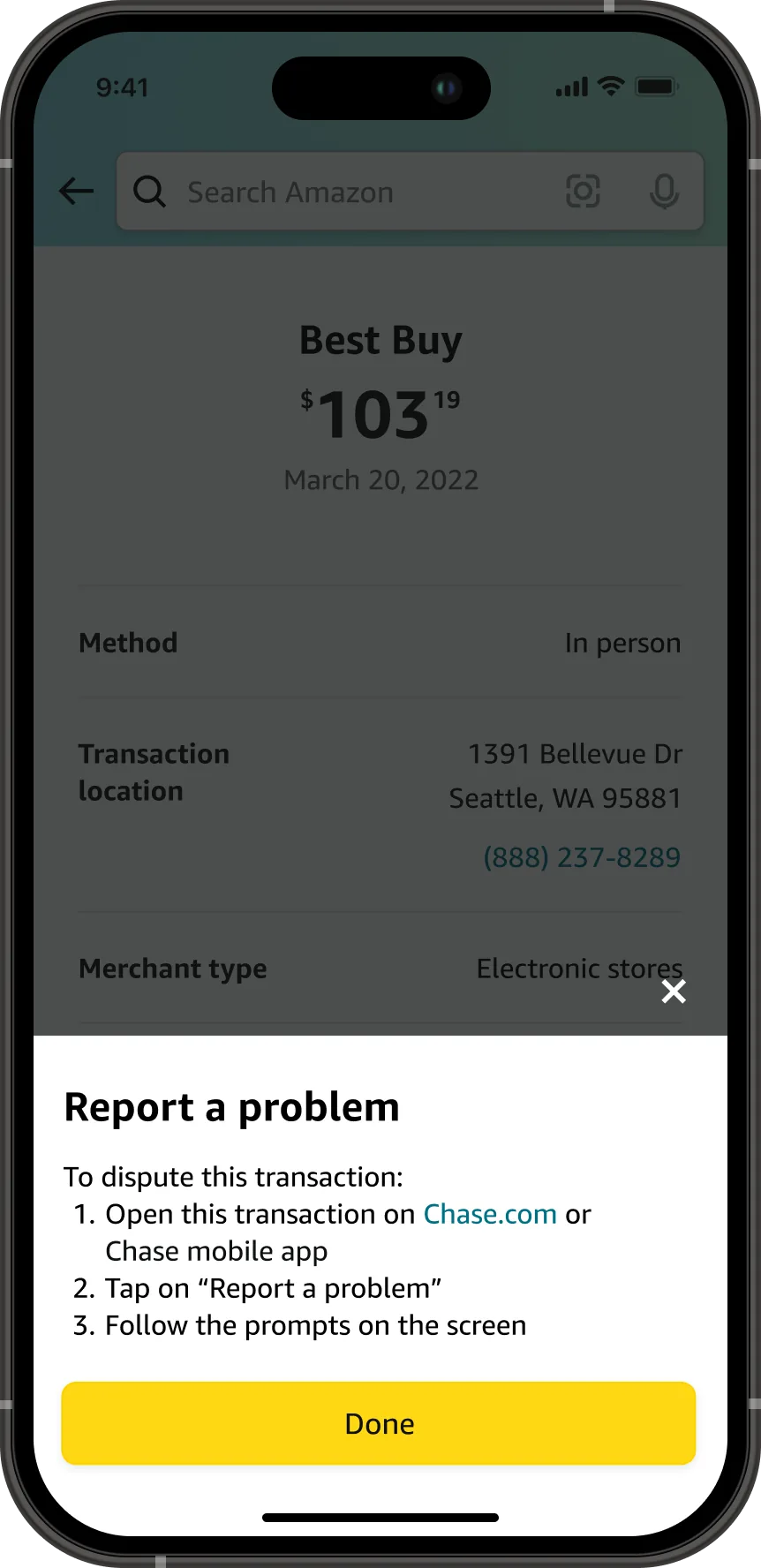
A Report a problem sheet over a dimmed transaction detail, with three numbered steps: open this transaction on Chase dot com or the Chase mobile app, tap Report a problem, and follow the prompts on the screen, above a Done button.
Disputes, handed off honestly. Disputes stayed at Chase in the first release, so the sheet names the three steps rather than dropping the customer onto a Chase home page.
The Transactions screen at the second release, with a Filter and Sort control, merchant logos beside each row, an order number shown inline under a 191 dollar 92 cent Amazon.com charge, and an IKEA row showing a 268 dollar 73 cent return in green.
The list, second release. Merchant logos, returns labelled as returns, order numbers inline, and filtering. The rows customers scan most now carry the things they scan for.
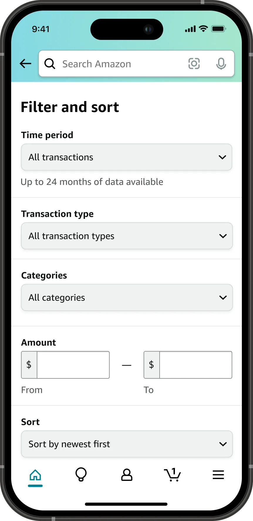
The Filter and sort panel, with a time period selector noting up to 24 months of data available, a transaction type selector, a categories selector, an amount range with From and To fields, and a sort control set to newest first.
Filter and sort. Time period, type, category, and amount. The 24 month limit is stated in the panel rather than discovered when a filter comes back empty.
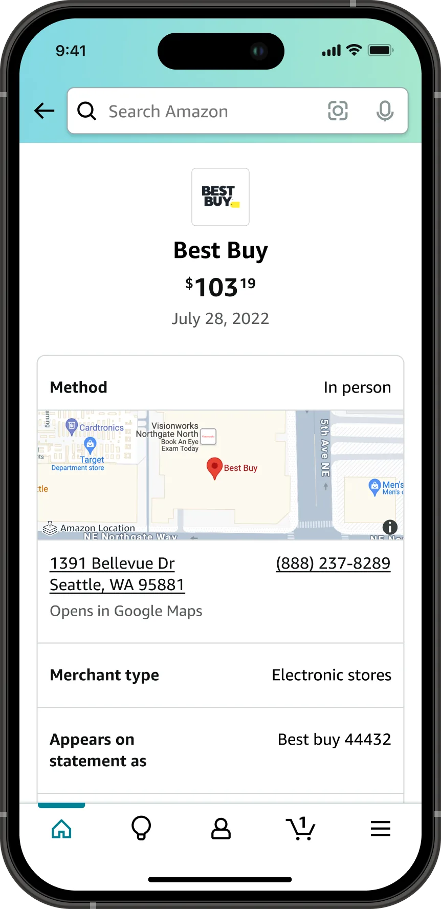
A transaction detail screen at the second release for a 103 dollar 19 cent Best Buy charge, with the merchant logo, a map of the store location, the street address as a link that opens in Google Maps with a phone number, the merchant type, and the name the charge appears under on the statement.
Detail, second release. The merchant's logo, a map of where the charge happened, and the name it appears under on the statement. Three ways to place a charge you do not remember.
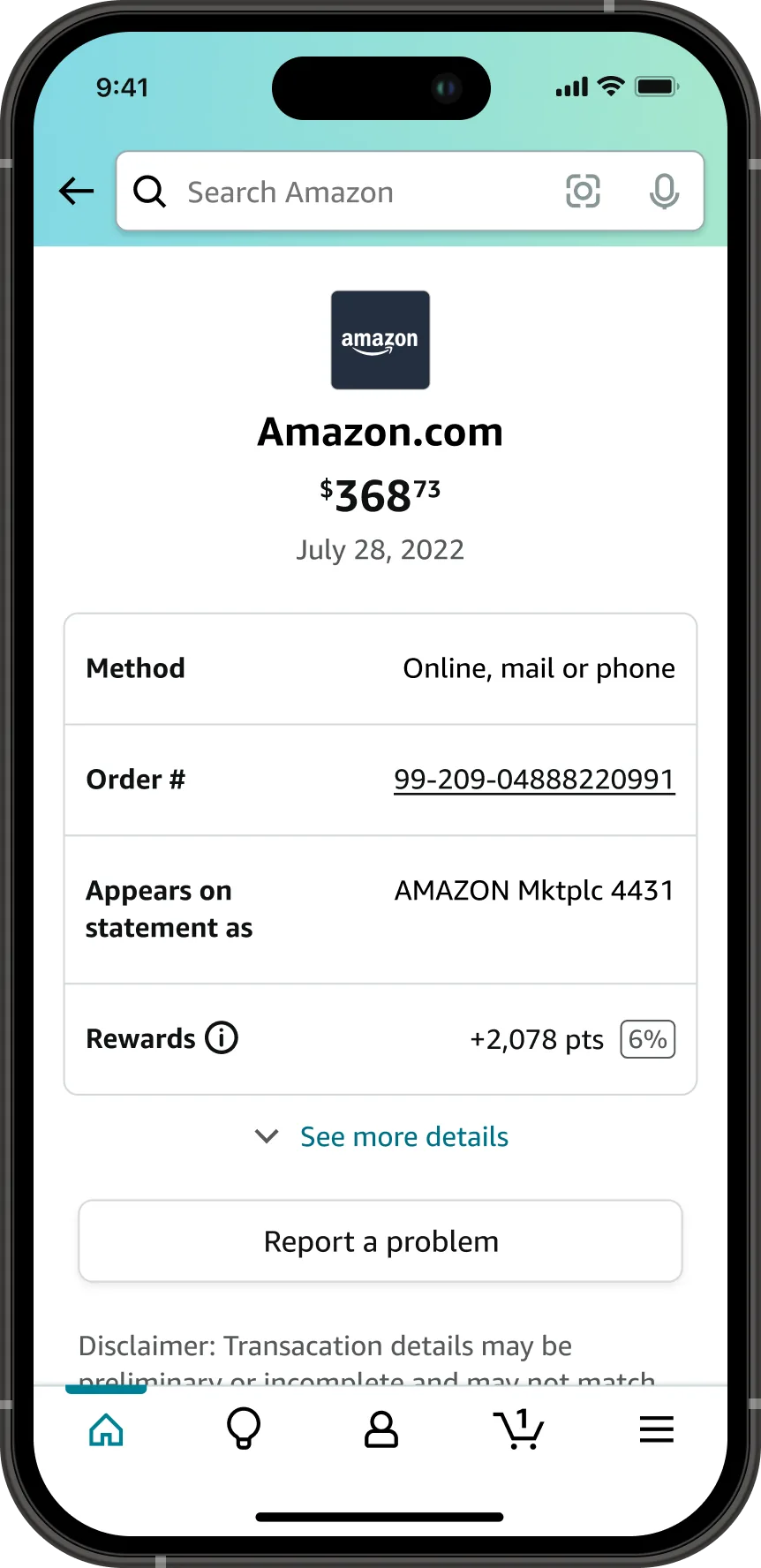
A transaction detail screen for a 368 dollar 73 cent Amazon.com charge with the Amazon logo, the method as online mail or phone, the order number as a link, the name it appears under on the statement, 2,078 rewards points earned at 6 percent, and a Report a problem button.
The same screen for an Amazon charge. Order number, statement name, and the rate that earned the points, so the reward is attached to the purchase that produced it.
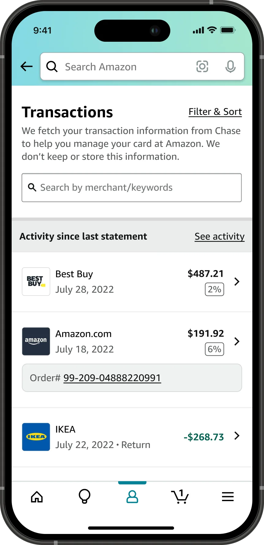
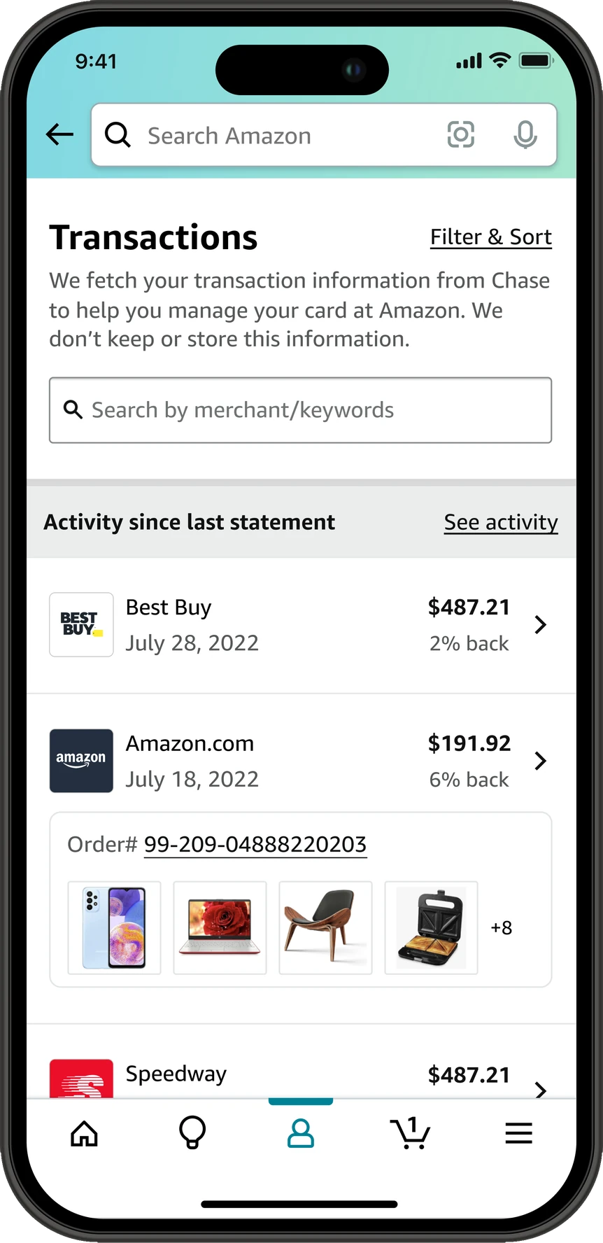
The transactions list at the third release, scrolled to Activity since last statement. A Best Buy row for 487 dollars 21 cents on July 28, 2022 reads 2 percent back under the amount, and an Amazon.com row for 191 dollars 92 cents on July 18, 2022 reads 6 percent back and opens out to an order number link with thumbnails of four items from that order and a plus 8 for the rest.
The list, third release. The items from an Amazon order sit in the row with the charge, so a customer can place a purchase without opening it. The earn rate is spelled out under each amount instead of sitting in a badge.
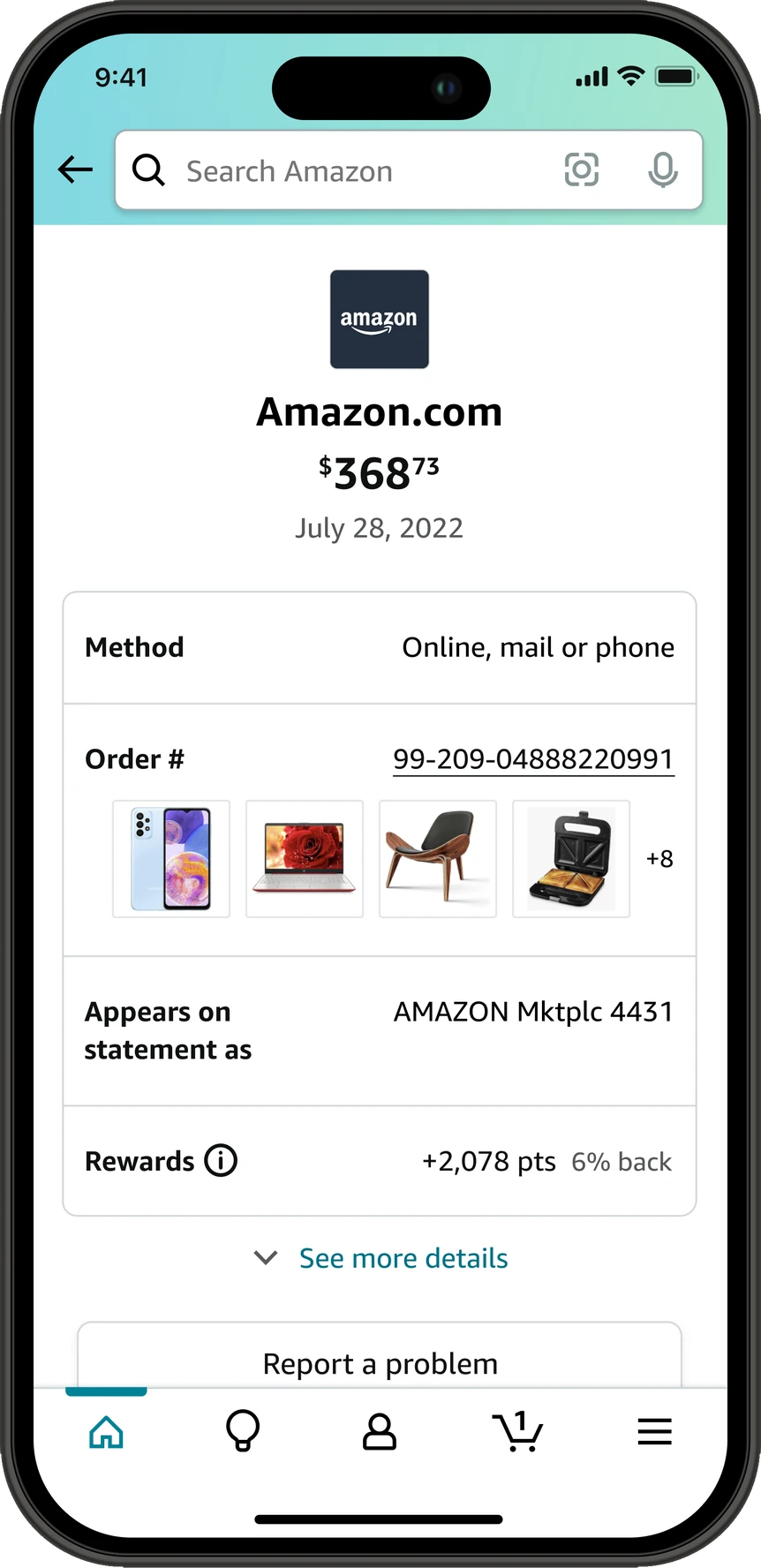
A transaction detail screen at the third release for a 368 dollar 73 cent Amazon.com charge. Under the order number are thumbnails of four items from the order and a plus 8 for the rest, and the rewards row reads plus 2,078 points with 6 percent back beside it.
Detail, third release. The items from the order appear under the order number here too. The rewards row states the rate next to the points it earned, where before the rate was a badge on its own.
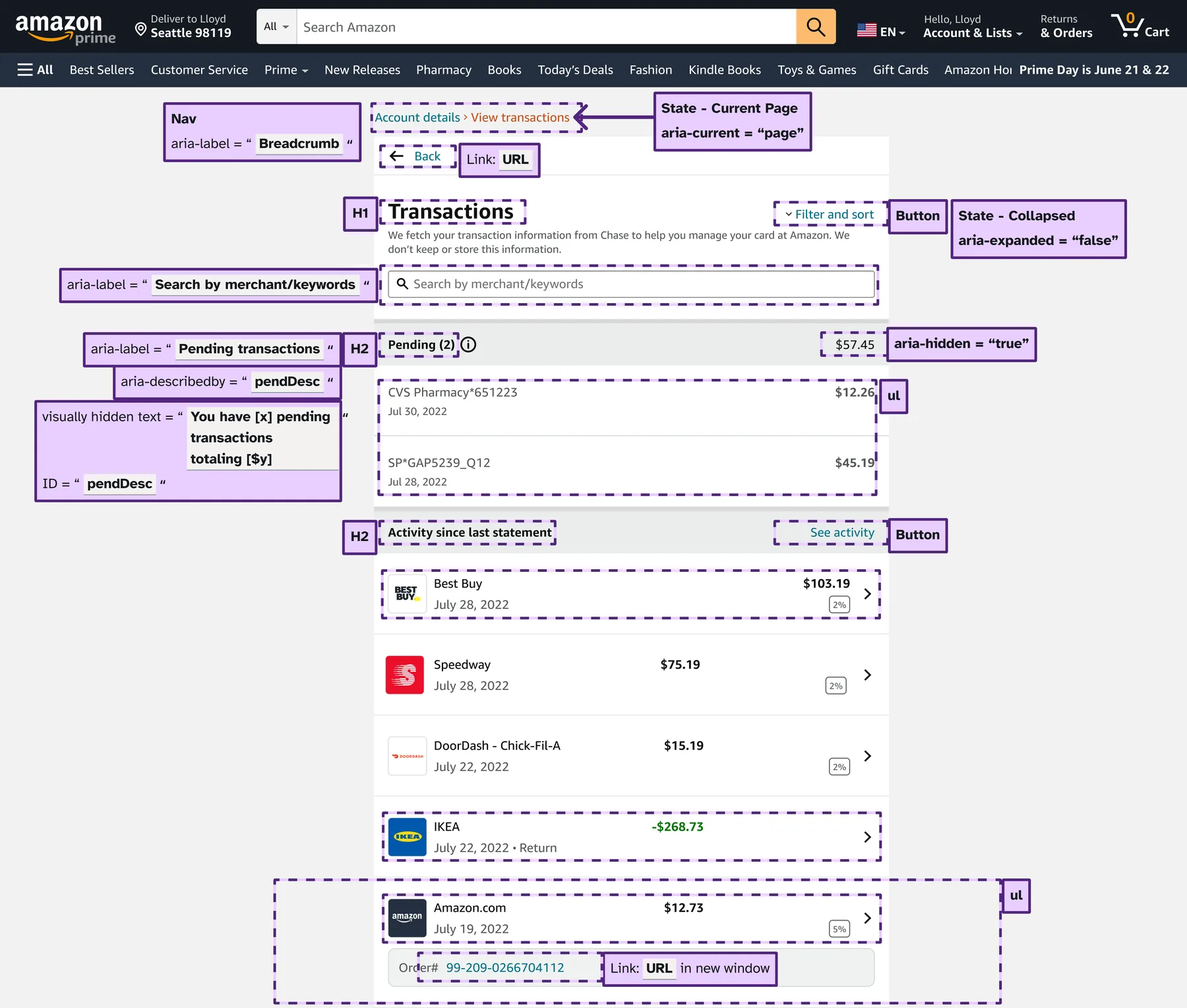
An annotated desktop transactions page. Purple callouts mark the breadcrumb as a navigation landmark with aria-current set to page, Transactions as the level 1 heading, Filter and sort as a button with aria-expanded set to false, an aria-label on the search field, Pending and Activity since last statement as level 2 headings, the pending amount as aria-hidden true, visually hidden text reading you have x pending transactions totaling y dollars tied to the heading by aria-describedby, the transaction rows as unordered lists, and the order number as a link that opens in a new window.
Accessibility annotations. Reading order, heading levels, roles, names, and states, handed to engineering with the mocks. The pending amount is taken out of the reading order because the same number is already in the heading's description.
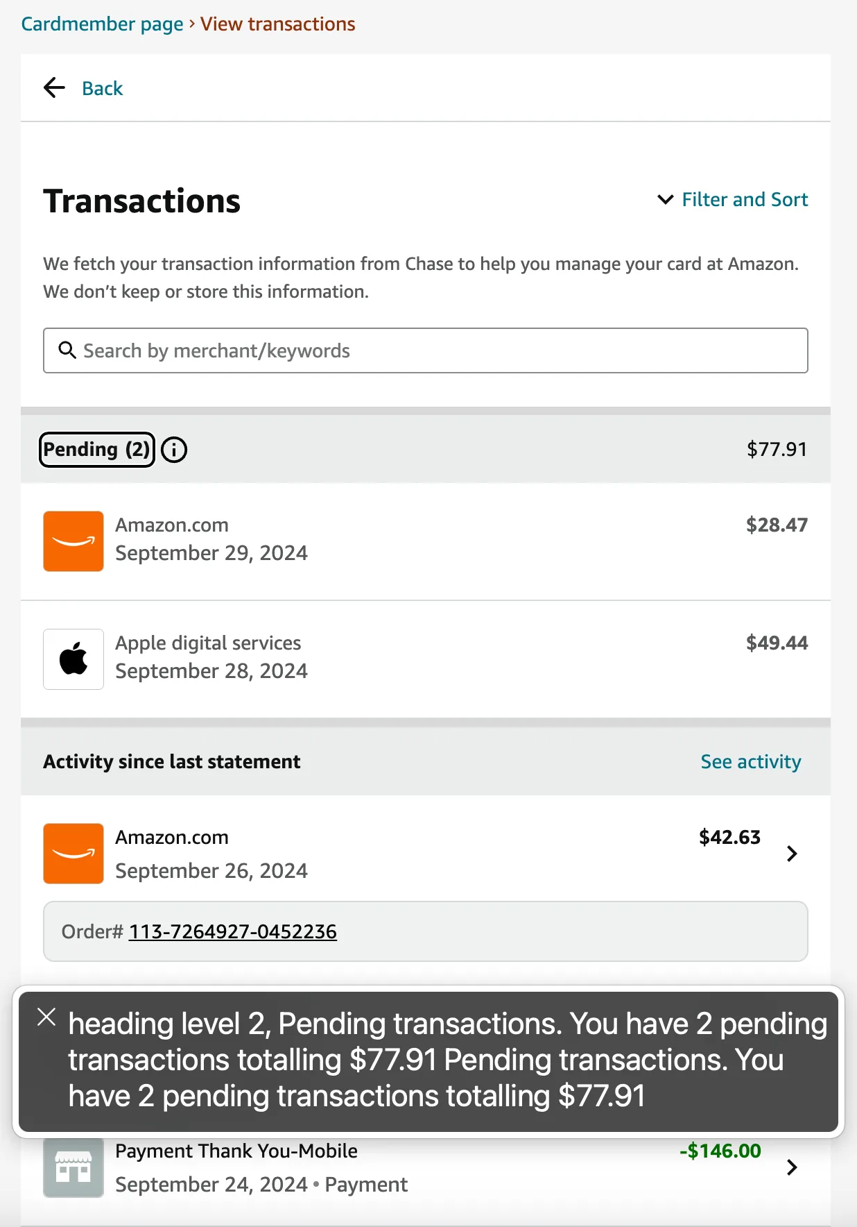
The shipped transactions page with the VoiceOver caption panel open across the bottom, reading: heading level 2, Pending transactions. You have 2 pending transactions totalling 77 dollars 91 cents.
The annotation, in production. VoiceOver on the live page, reading the heading and the description it was given. An annotation is only worth writing if it survives to production, so this is what I check.

This page shows only parts of the project. In-depth and sensitive details, and the end-to-end UX, can be covered in person or during the interview process.